To Design or Not to Design, That is the Question
A professionally designed logo is extremely important to businesses of all types and sizes. As the initial first impression of your firm, your logo often gives clients a glimpse into what your firm is all about. It sets the tone for your business. It makes your firm more instantly recognizable. And it creates a visual identity that will help attract new clients.
What is a Logo?
A logo is a visual representation of your firm. This can be type set in an artist way, an image or any other custom mark.
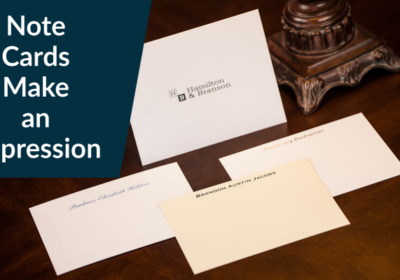
A type-based logo, or a wordmark (see samples here), is your firm name set in a specific, fixed way. Corporate examples include Exxon, FedEx and Coca-Cola. Law firm examples include Balch & Bingham and Winstead. An icon logo is more of a graphic symbol that represents the firm. Corporate examples include the McDonald’s golden arches or the Nike swoosh. Law firm examples include Sterne Kessler’s light bulb icon. A combination of both is also a consideration – like Casner & Edwards.
As service providers, many law firms, accountants and financial advisers will rely on a wordmark for several reasons:
- It’s an easy and effective way to optimize on their reputation
- Type-based logo design projects are simpler and tend to cost less
- A well-crafted type-based logo design can convey a sense of professionalism
What Makes a Good Logo
A logo should be the most recognizable and memorable icon of your firm. It should be unique, yet easily identifiable and understandable. Your logo should convey your firm’s identity, culture and professionalism. In order to aid in attracting new clients, it needs to be memorable.
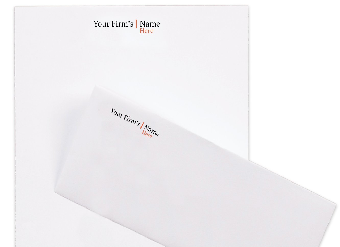
You will use it in many mediums – on business cards and letterhead, on office signage, on billboards, in print advertising, on your website, etc. So it needs to be scalable, flexible and adaptable. It should be just as recognizable on a business card as it is on a billboard. It also needs to look good in color, black and white and knock-out (typically white with a dark background). While it should always be rendered consistently, you will need variations based on placement and usage. Be sure to request horizontal and square versions as well. Square versions are often needed for social media sites and promotional products such as personalized pens or mugs.
How to Make Your Logo Design Stand Out
One of the easiest ways to make your logo memorable is to add color. The days of black and white logos are long past. With all the production enhancements available today, it is fairly cost-effective to add color to your logo.
But how do you choose what color or colors to include in your design? The key is to keep it simple – usually one or two colors. If you want to project a strong image, use bold, darker colors. If you are looking to project a more modern feel, lighter, cooler colors are appropriate. For the latest color trends, visit this post.
How to Make Your Brand Consistent
The more standards you can design, the easier it will be for your designers and printers to maintain consistency. Three key elements should be considered when building your brand standards.
- Color
Once you have established your logo colors, request logo files with print ready Pantone (or PMS) colors, CMYK (for 4 color print), RGB (for screen representations) color and web (HEX) colors to ensure consistency from one medium to another.
In addition to your logo colors, be sure to choose complementary colors. These additional colors can be used to create visual continuity from one piece to another.
- Typestyle/Font
Often typestyles will be chosen based on your logo design. However, this doesn’t mean that complimentary standard fonts cannot be used. For instance, the type in your logo design may be all capitals and the lower case letters may not be as readable.
Complementary fonts can be used within marketing materials and on websites to ensure readability. This will also extend the brand and unified feeling from piece to piece. Keep in mind that not all fonts are available in Mac and PC versions and smartphones do not have access to the same full library of fonts.
- Standard Treatments
Consider the following…
How do you show your phone and fax numbers? Do they have periods, dashes or blank spaces? Do you do show a +1 in front?
How do you indicate what the numbers represent? Do you use an initial (P, C/M, F) or show the whole word?
Do you include a vCard address to make it easy for contacts to download your information easily and correctly?
Are extensions shown with an X, X., x, x., Ext., or ext.?
How is your website shown – with or without the www?
Answering these questions and creating standard treatments will help establish unification across all your branded materials.
Professional Design – It’s Worth the Investment
With so much hinging on your logo design, it’s definitely worth the investment. Your firm name is not enough. By designing a type-based logo, you complete the picture of your visual identity.
A professionally designed logo is extremely important to businesses of all types and sizes. As the initial first impression of your firm, your logo often gives clients a glimpse into what your firm is all about. It sets the tone for your business. It makes your firm more instantly recognizable. And it can prove that your firm is an established business that can be trusted and relied on thus helping to attract new clients.
You may also be interested in:
Why Rebrand? 7 Business Indicators
Business Development – 5 Ways to Impress Clients
3 Ways to Incorporate Sensory Marketing in Your Business Development