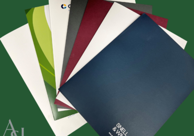
The Power of Color – An In Depth Look at the Perception of Law’s Top 3 Choices
- Stats: 1687 3
- Posted: March 23, 2018
- Author: Brandon
- Category: Branding, Business Development, Marketing
Color. It can make you feel. Make you pay attention. Make you remember.
Color is one of the most powerful tools for communication and evoking emotion. However, it’s common to under-use or misuse color.
There are many articles, papers and even books devoted to color theory, color psychology and the effects of color on advertising. While the topic is broad, we will focus on the top 3 colors used in large law firm branding and how those colors can influence a potential client’s impression.
Color’s Emotional Response
A study called Impact of Color on Marketing found that people form impressions within 90 seconds of their initial interactions with people or products. The amazing part of the study showed that up to 90% of the assessment is based on colors alone. Scientists have found that when humans are exposed to certain colors, they experience actual physiological changes.
Color can enhance emotions such as excitement, anxiety, depression and relaxation. It can stimulate or dampen appetite. It can even have an effect on the perception of temperature. A study conducted by a paint company found that employees in blue offices tended to complain that it was too cold. However, when the same offices were painted peach, employees felt warmer even though the actual temperature never changed.
While the perceptions color creates can be shaped by personal experiences, there are commonalities. Every color and shade elicits a different and unique emotional response. Generally, brighter shades of color illicit more energetic feelings while darker shades feel more relaxing. These commonalities can be used when choosing colors for brands, marketing, websites and communication.
Now let’s discuss the colors found in some of the largest American based law firms…
#1 – Blue
Blue is associated with depth and stability. It symbolizes trust, loyalty, wisdom, confidence and intelligence. Blue inspires feelings of calmness and security. For these reasons, over 45% of large law firms use blue in their branding.
The color blue is also very versatile in design. It can be vibrant and friendly or cool and steady. And when used with warm colors, like yellow or red, it can create high-impact, memorable designs. Light blue is generally refreshing – bringing a soft, calming energy to any brand. Dark blue represents knowledge, power, integrity, and seriousness.
When surveyed, one firm responded that the blue logo…
Gives the impression of steadiness, trust, professionalism and prestige.
#2 – Red
Red is associated with energy and passion. It symbolizes strength, power and determination. Red inspires feelings of importance. For these reasons, over 26% of large law firms use red in their branding.
The color red attracts attention making it useful in branding and marketing. It can be used to make people make quick decisions – which is why it is often found in “buy now” buttons. Bright red is generally associated with boldness, energy and passion. Dark red, burgundy and maroon represent power, endurance and leadership.
When surveyed, one firm responded that the red logo…
Gives an impression of warmth and boldness.
#3 – Green
Green is the color of nature. It symbolizes growth, stability and freshness. Green inspires feelings of safety. It is also commonly associated with money. For these reasons, over 15% of large law firms use green in their branding.
The color green is a balanced color that stands out next to both warm colors (red, orange and yellow) and cool colors (blue and purple). Green suggests stability and endurance. Light or bright green is generally associated with friendliness, youth and endurance. Dark green represents wealth, ambition and determination.
When surveyed, one firm responded that the green logo…
Gives an impression of tradition.
Underused Colors
Now that we know the top 3 colors used in the legal marketplace, let’s focus on 3 underused colors. The use of these colors can instantly make a firm stand out in a sea of blue, red and green just by being different.
#1 – Yellow
Yellow is associated with energy and intellect. It symbolizes success, understanding and creativity. Yellow inspires feelings of confidence. Yet only 1% of large law firms use yellow in their branding. When you include gold in the yellow family, that number jumps to nearly 16%.
The color yellow can be hard to read in text form (hence the darker yellow/olive color used in the title!). This may be one of the reasons for its under-use. Still there are many benefits to using of yellow in brands and marketing. It is seen before all others when placed against black. Feelings of warmth and cheerfulness and stimulation of mental activity and memory are associated with yellow. Bright yellow attracts attention and invokes feelings of revitalization, energy and loyalty. Light yellow is associated with intellect, freshness, and joy. Prestige, wisdom, quality and endurance come to mind when seeing Gold tones.
#2 – Orange
Orange combines the energy of red and the happiness of yellow. It symbolizes enthusiasm, success and creativity. Orange inspires feelings of determination and encouragement. Nonetheless, only 5% of large law firms use orange in their branding.
While orange is a hot color, it is not as severe as red. It maintains the high visibility associated with red, but without overwhelming the message. Bright orange is associated with health, energy and vibrancy. Dark orange can invoke feelings of strength and endurance.
#3 – Purple
Purple combines the stability of blue and the energy of red. It symbolizes healing, wisdom, strength and ambition. Purple inspires feelings of dignity, creativity and mystery. But still, only 1% of large law firms use purple in their branding.
Because purple is a very rare color in nature, some people consider it to be artificial. Long associated with royalty, purple can create a feeling of decadence. Purple, when used as the dominate color, can create a sense of elegance and high-end quality. Light purple evokes romantic and nostalgic feelings. Dark purple inspires feelings of wealth and luxury.
Accent Colors
The colors below are often used in multi-color logos and as accent colors to the more vibrant colors discussed above.
#1 – Black
Almost 50% of large law firms use black as either the main or accent color. Black is associated with power, elegance and formality. It denotes feelings of strength and sophistication. Using black can make other colors stand out and it contrasts well with bright colors. Typically used sparingly, for things such as text, black works well as the primary color for backgrounds.
#2 – Gray
As the intermediary between black and white, gray defines neutrality. However, it can be a very powerful tool. As a featured color, gray inspires feelings of formality and traditionalism. In backgrounds, gray gives a feeling of professionalism while allowing featured colors and images to take center stage. Based on the vibrancy, it can be either attention grabbing or be subdued. This may be the reason over 31% of large law firms incorporate gray or silver in branding.
#3 – Brown
While not a popular choice, brown can work well as an intermediary or accent color. It is most associated with richness, leather and nature. Brown can exude a classic, traditional or rustic atmosphere. Pairing brown with other colors effectively is tough, which may be why only 5% of large law firms incorporate brown in branding.
The Power of Color
It is true that color can effect perception, memory and emotions. Additionally, personal experiences, surroundings and circumstances can shape that perception. However, every firm can use the power of color to project their culture, brand and image.
Contact your account manager today to see live samples of law firm brands, stationery and marketing materials and for ideas on using color more effectively.
You May Also Be Interest In:
Why Rebrand? 7 Business Indicators That Show Its Time


